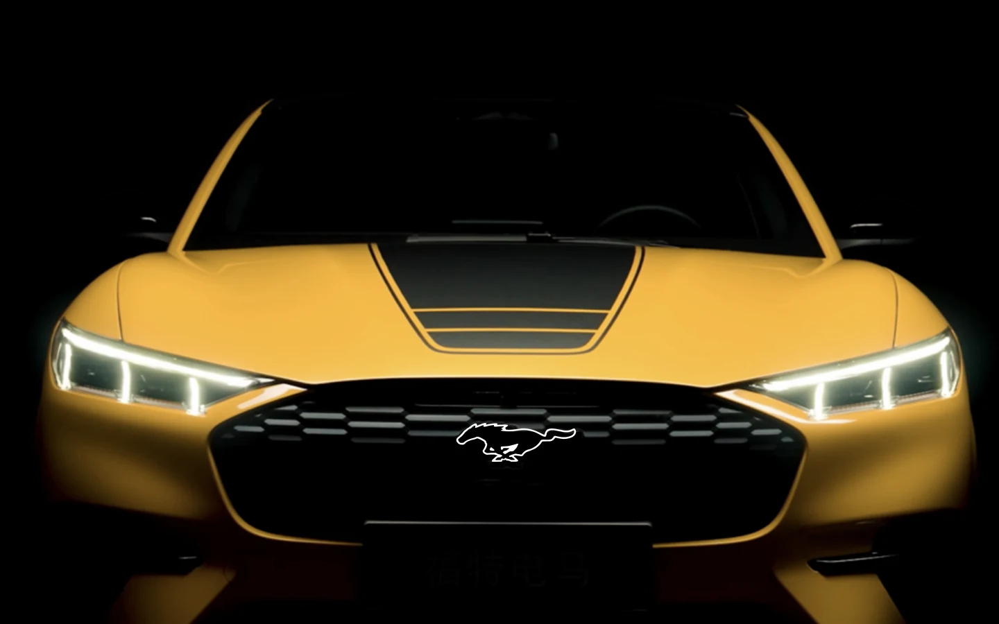
Important content was hidden behind a menu people struggled to locate.
The original review showed that many visitors' memory of the experience stopped at the homepage.
Ford Motor China · Employer project · 3 months
As Mustang Mach-E prepared a model and visual refresh, its China website also needed to respond to more contemporary EV experiences and Ford's evolving brand system. The project became a pilot for turning a fragmented product page into one guided exploration.
I owned UI/UX and motion as the sole designer. Working with marketing and other departments, I shaped the initial flow, divided the story into meaningful sections, designed layouts and interactions, and documented the system for implementation.
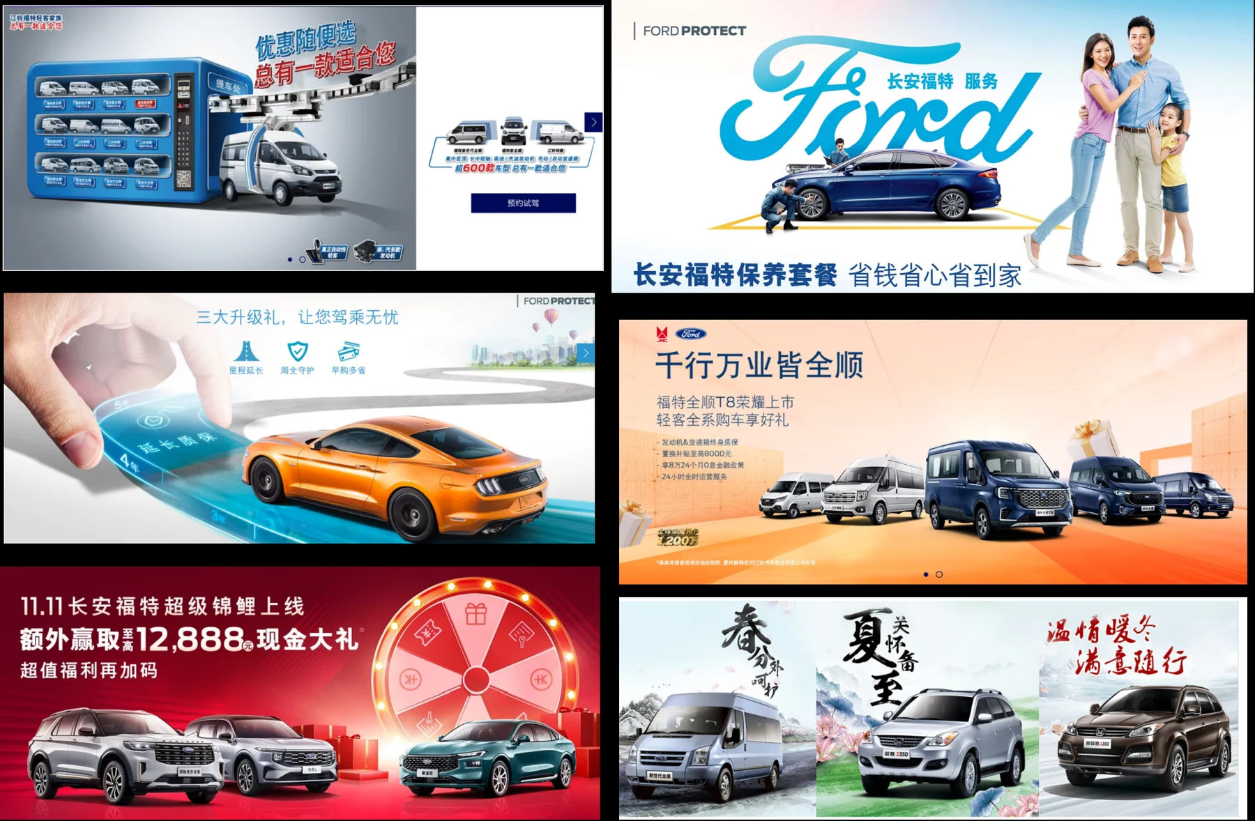
The original review showed that many visitors' memory of the experience stopped at the homepage.
Product images and promotional banners did not build enough logic or detail to support vehicle understanding.
Overlap and non-clickable content created friction on smaller viewports and weakened the brand presentation.
Seven opportunities in the original work were consolidated into three rules that could guide information architecture, visual design, interaction, and platform adaptation.
Reorganize the journey around the questions people bring to the site, with visible navigation and a clearer path from discovery to action.
Translate performance, technology, design details, and ownership infrastructure into focused scenes instead of a stack of marketing banners.
Keep the brand and product narrative consistent while adapting the interface for desktop, H5, app-embedded, and WeChat Mini Program contexts.
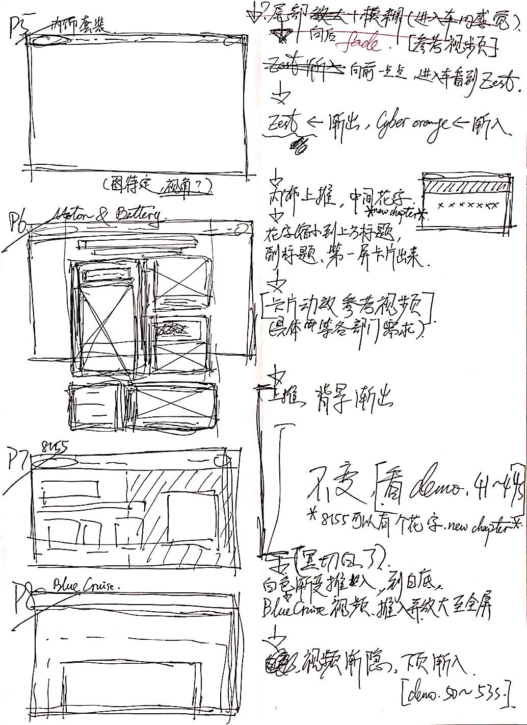
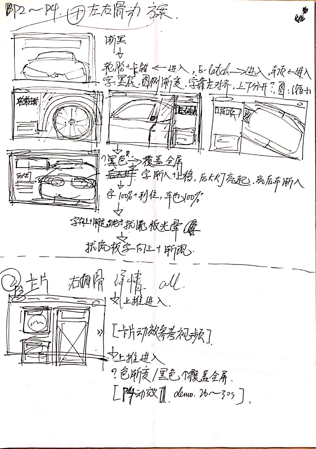
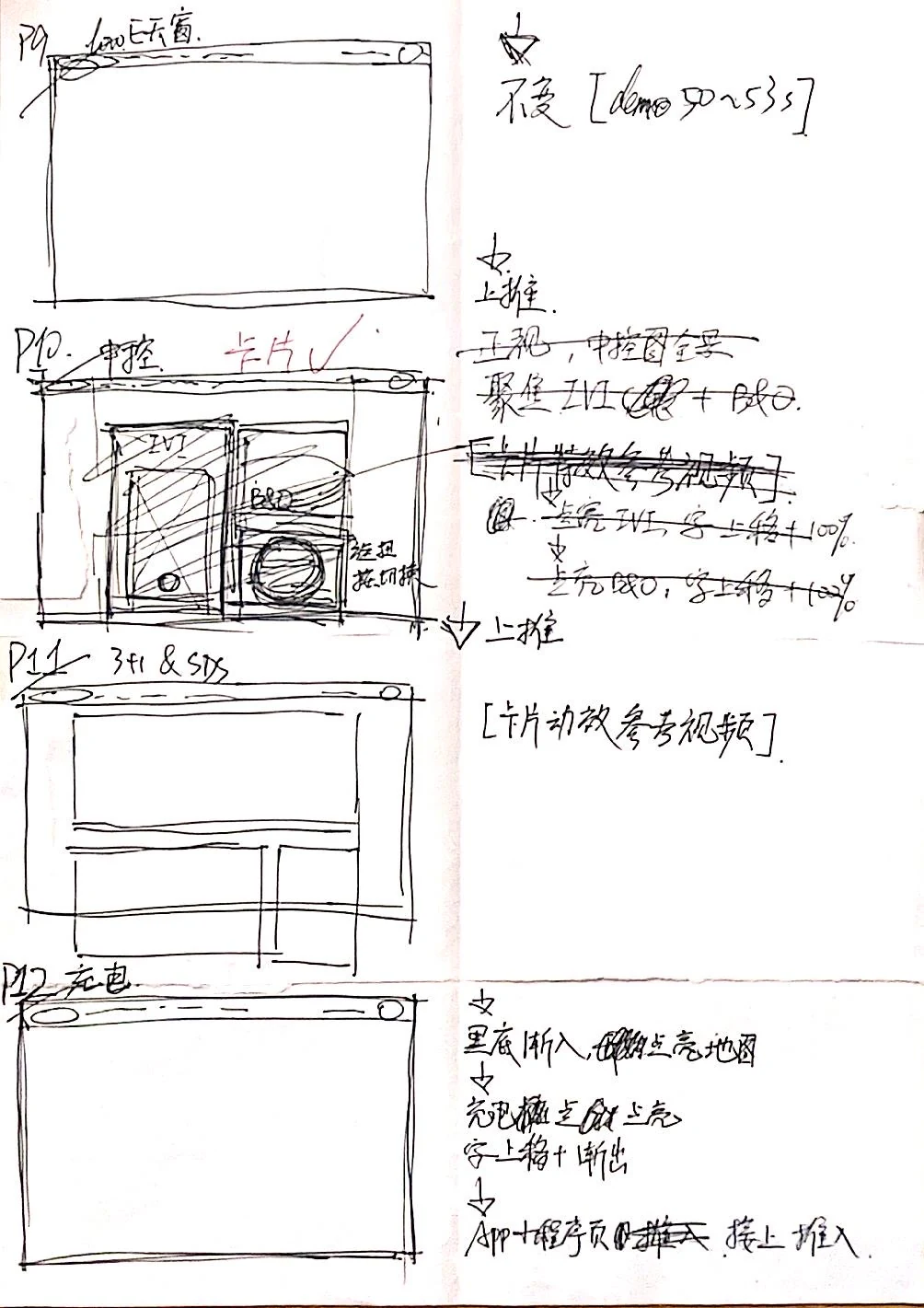
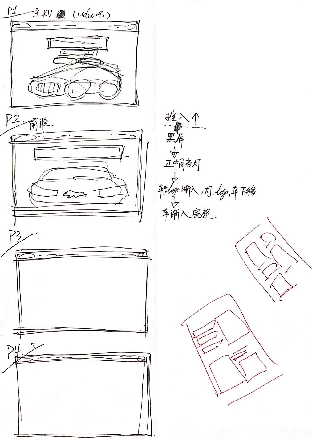
Participatory ideation
I first outlined the experience with marketing and other departments, then translated each section into layout, motion, and interaction ideas. The sequence followed how someone learns about the vehicle: identity, exterior, performance, intelligence, confidence, and ownership support.
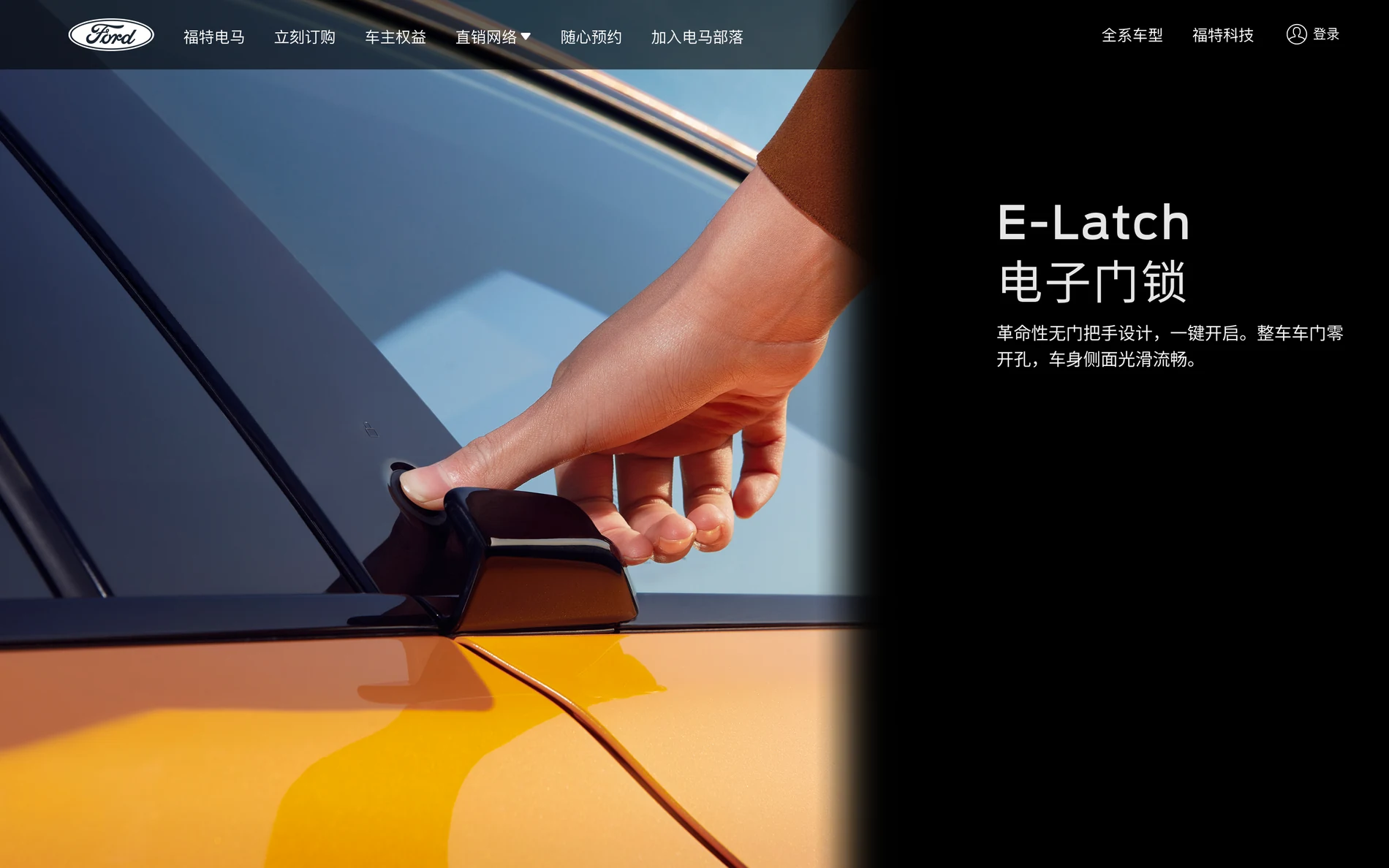
The desktop story uses full-screen imagery, focused copy, and purposeful movement. Instead of showing every one of the fourteen sections here, the case study surfaces the moments that best demonstrate the system.
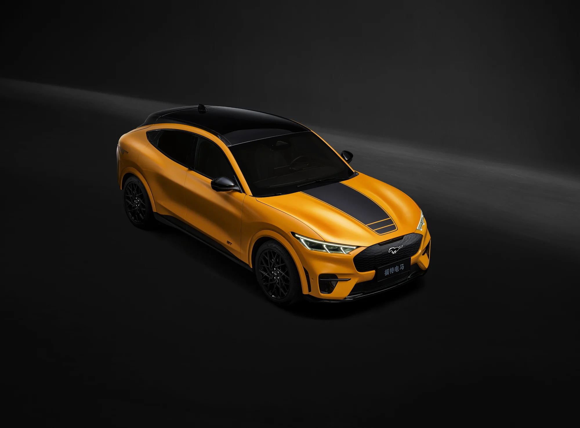
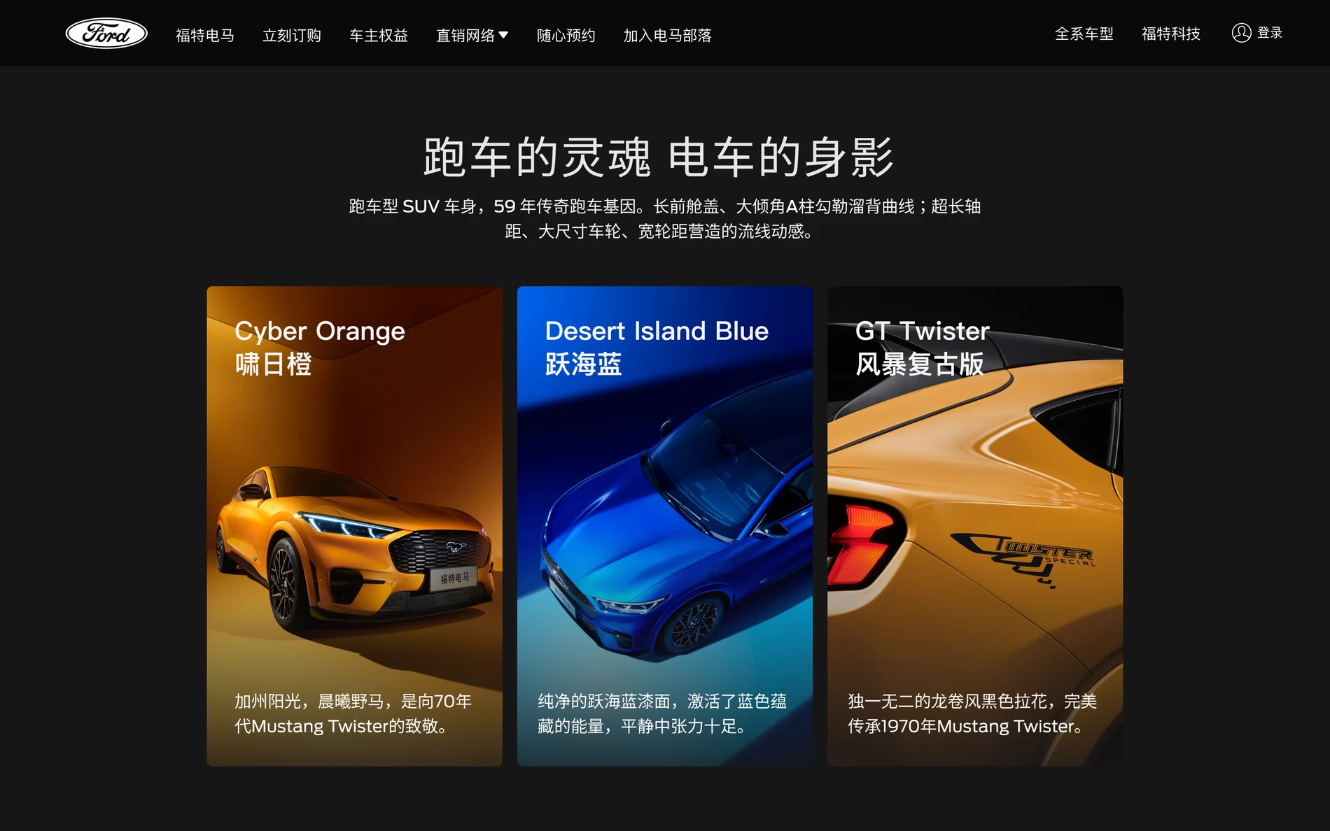
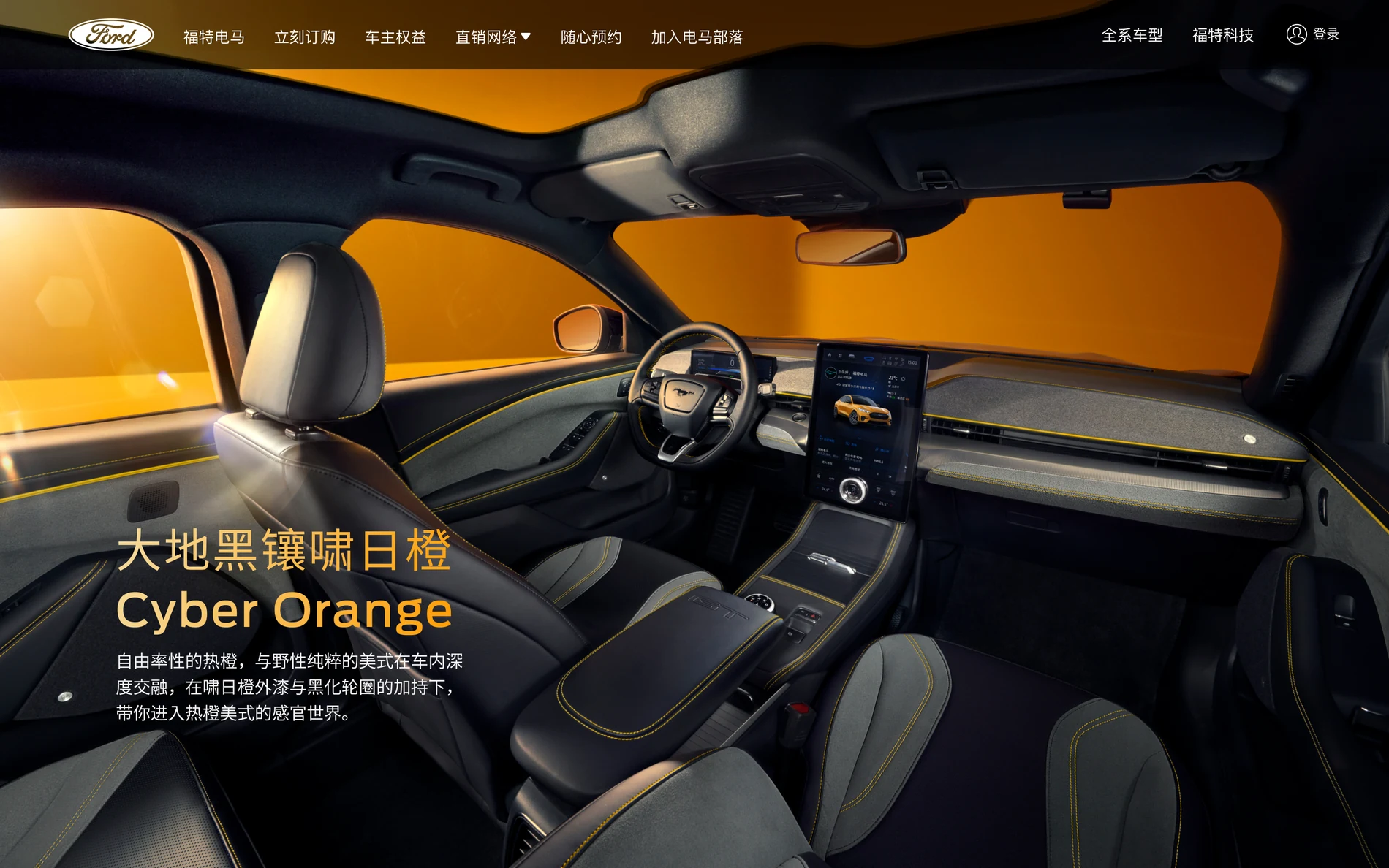
Three vehicle colors became a visual chapter. Exterior and interior details then move from broad silhouette to close interaction.
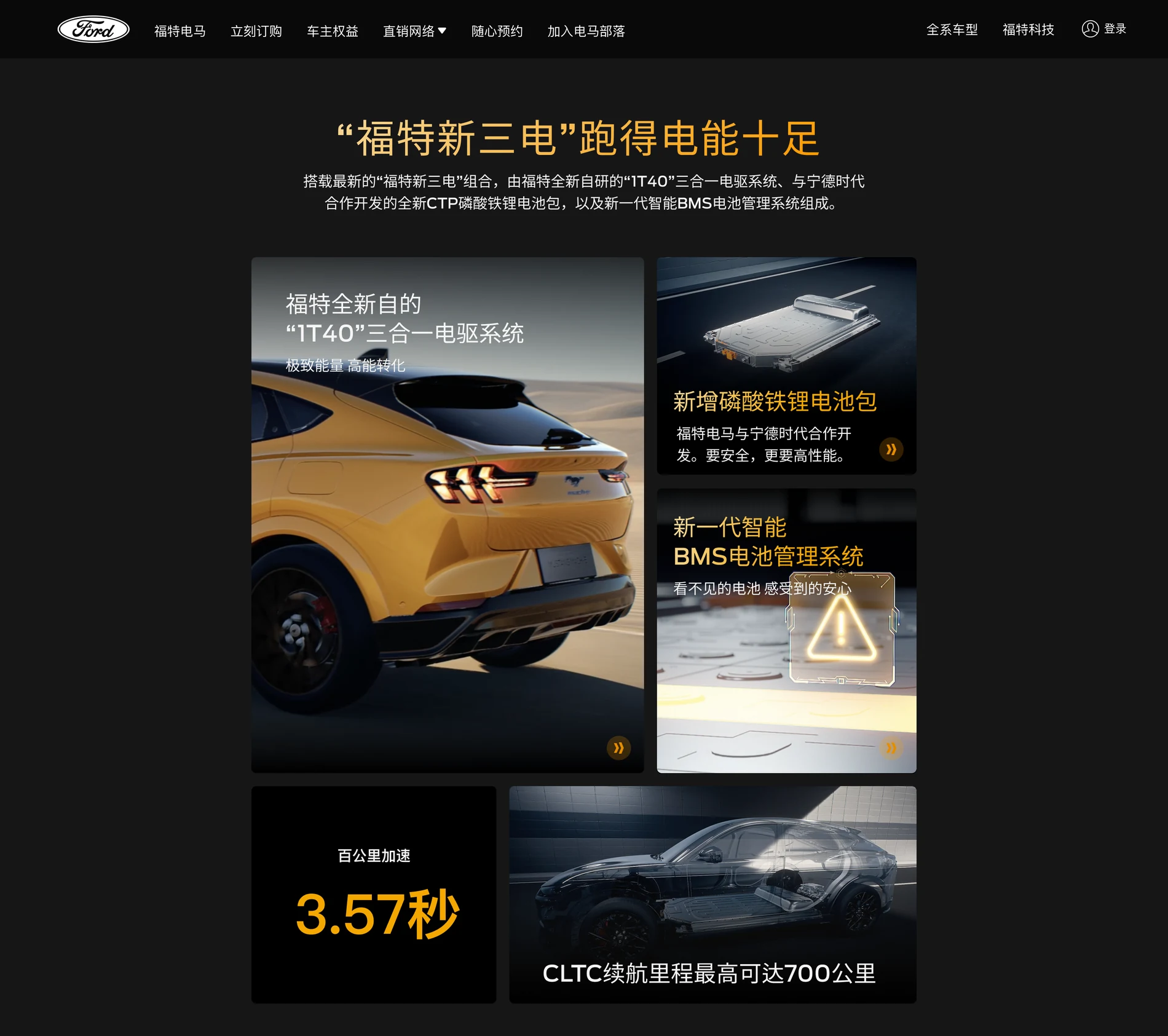
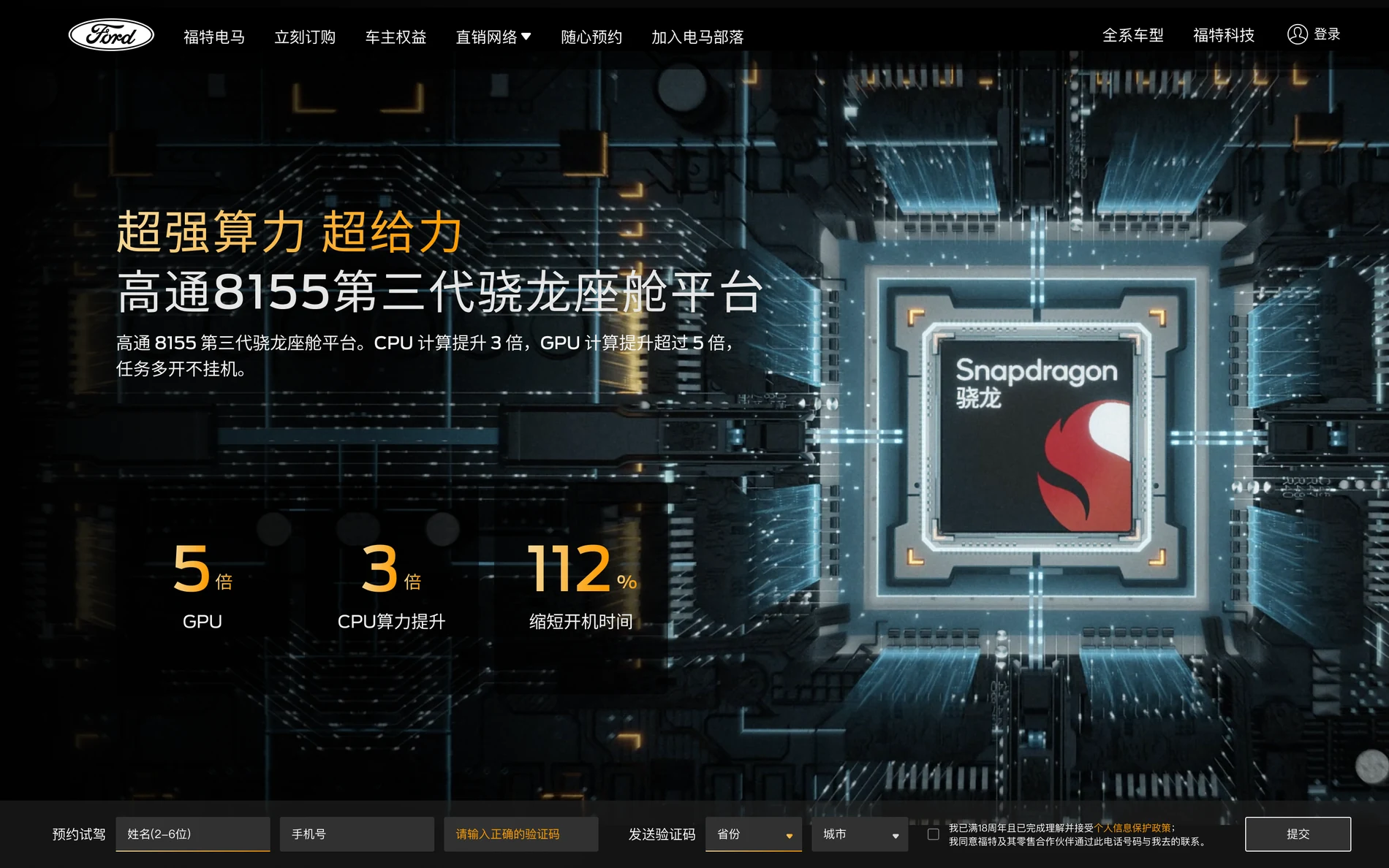
Performance moved into a modular system: a chapter overview introduces the relationships, while focused screens unpack the platform and driving intelligence.
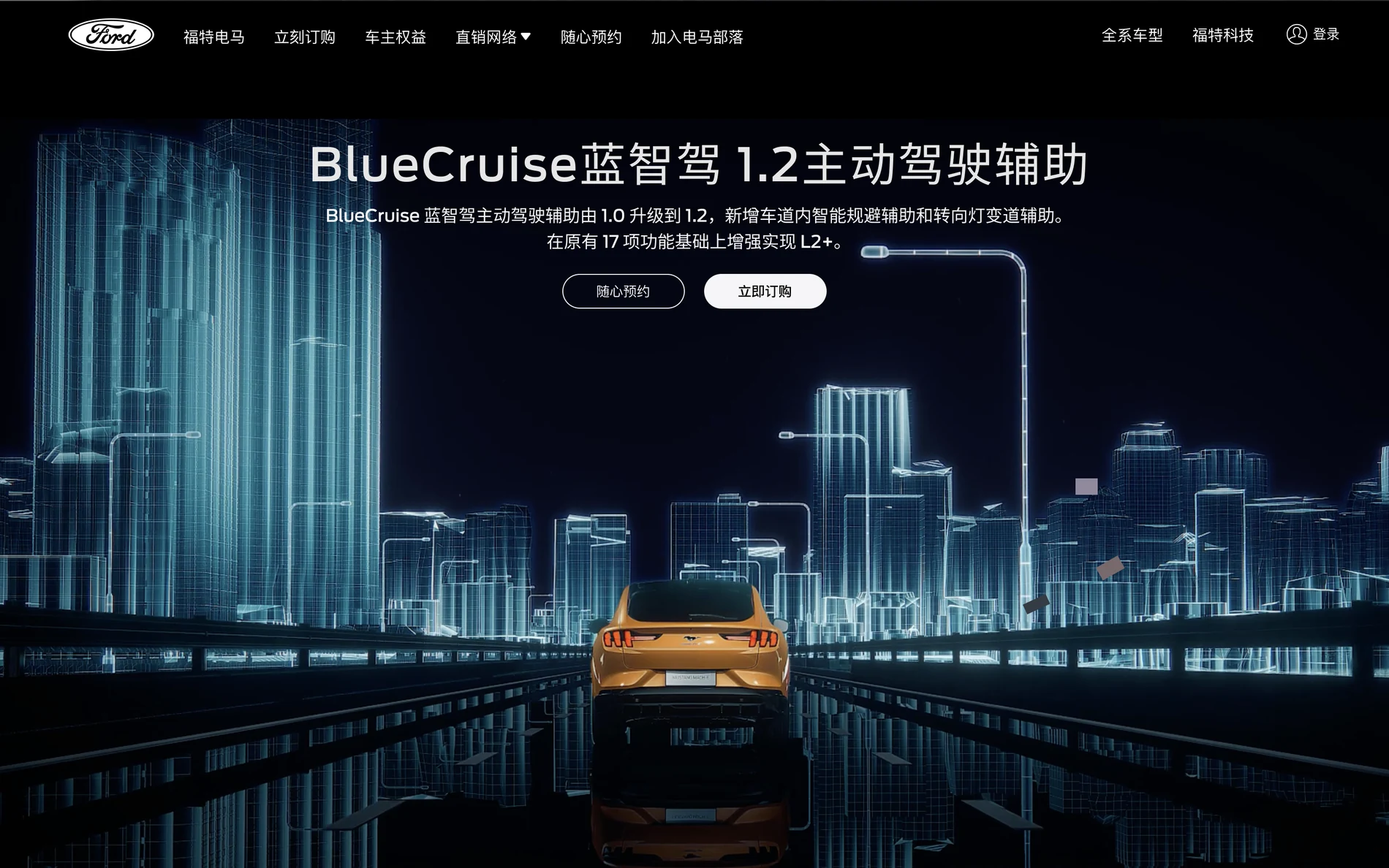
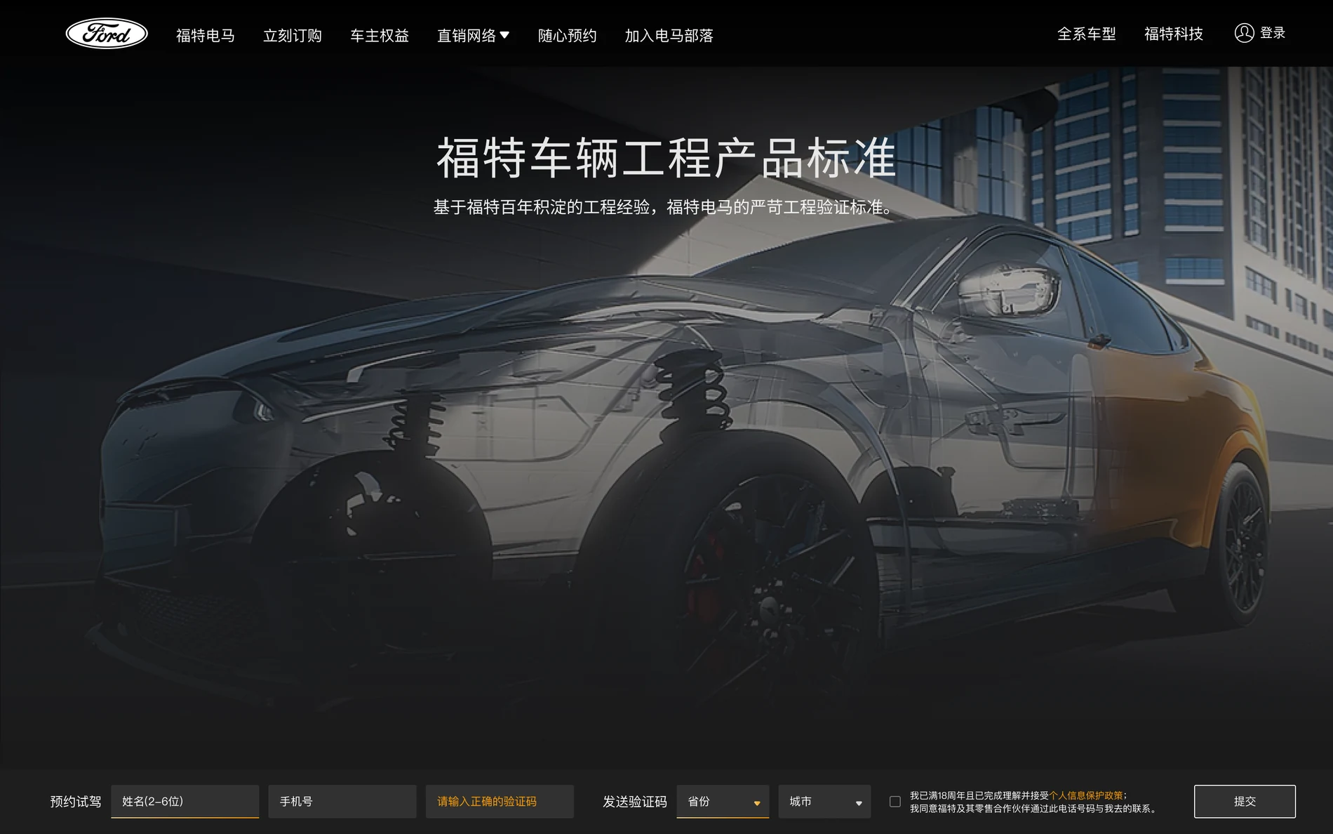
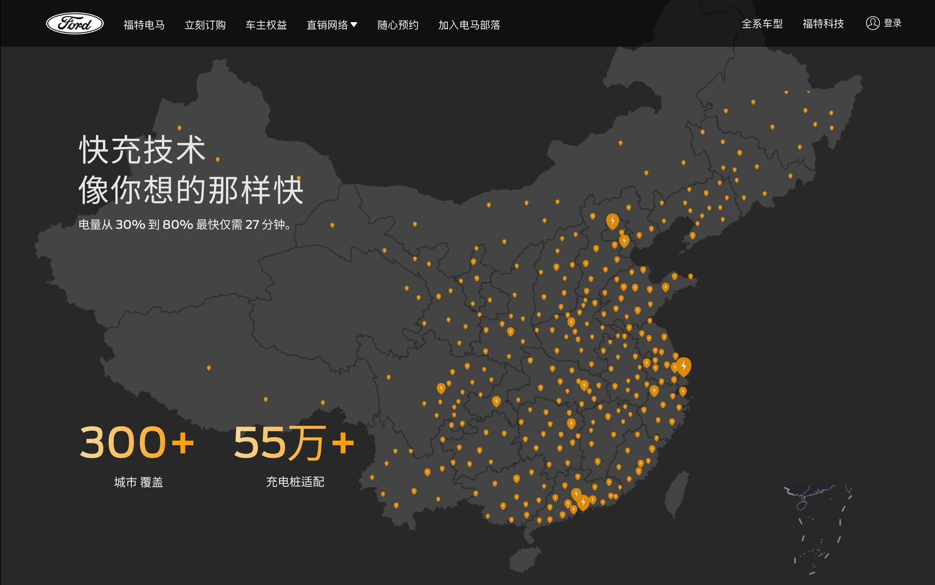
Engineering standards and charging infrastructure close the gap between product desire and ownership confidence.
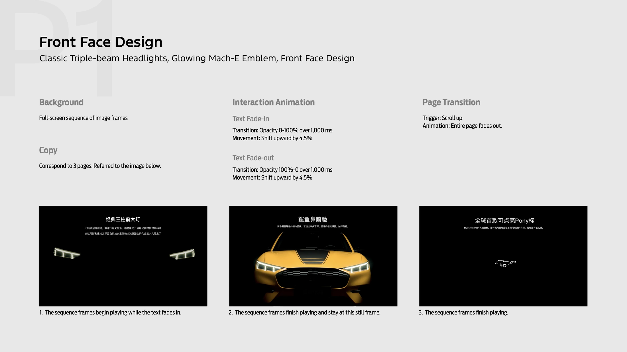
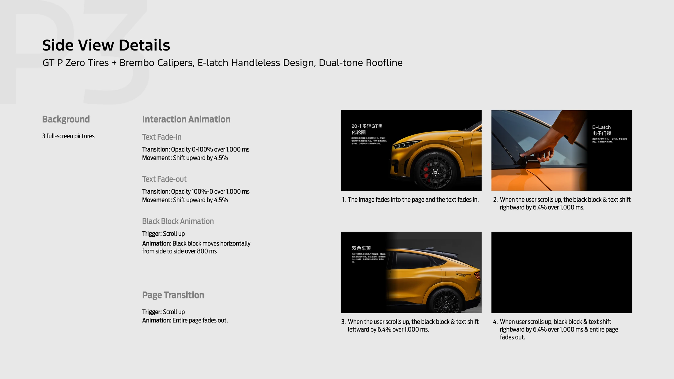
Motion specifications defined triggers, duration, distance, fades, page transitions, and the relationship between sequence frames and copy. The goal was to direct attention while preserving the cinematic pace.
Copy fades from 0–100% opacity while shifting upward; sequence frames establish the product moment.
Scroll triggers coordinate image, color block, copy, and page movement instead of animating elements independently.
Card details and tabs connect motion to navigation, helping people understand where they are and what changed.
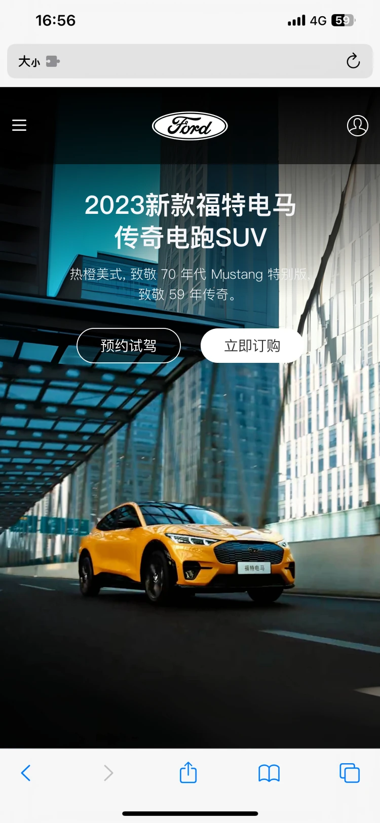
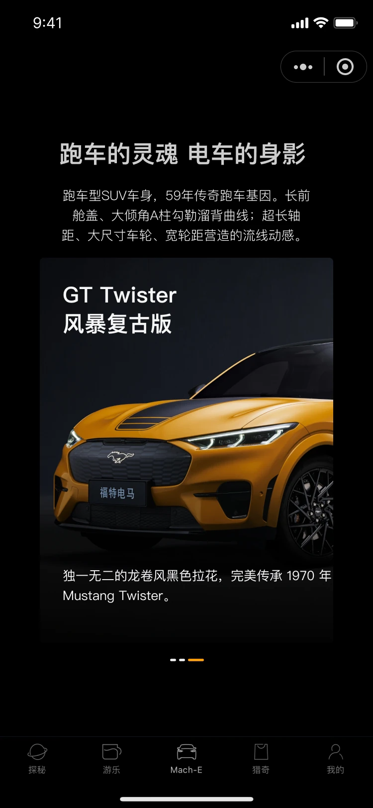
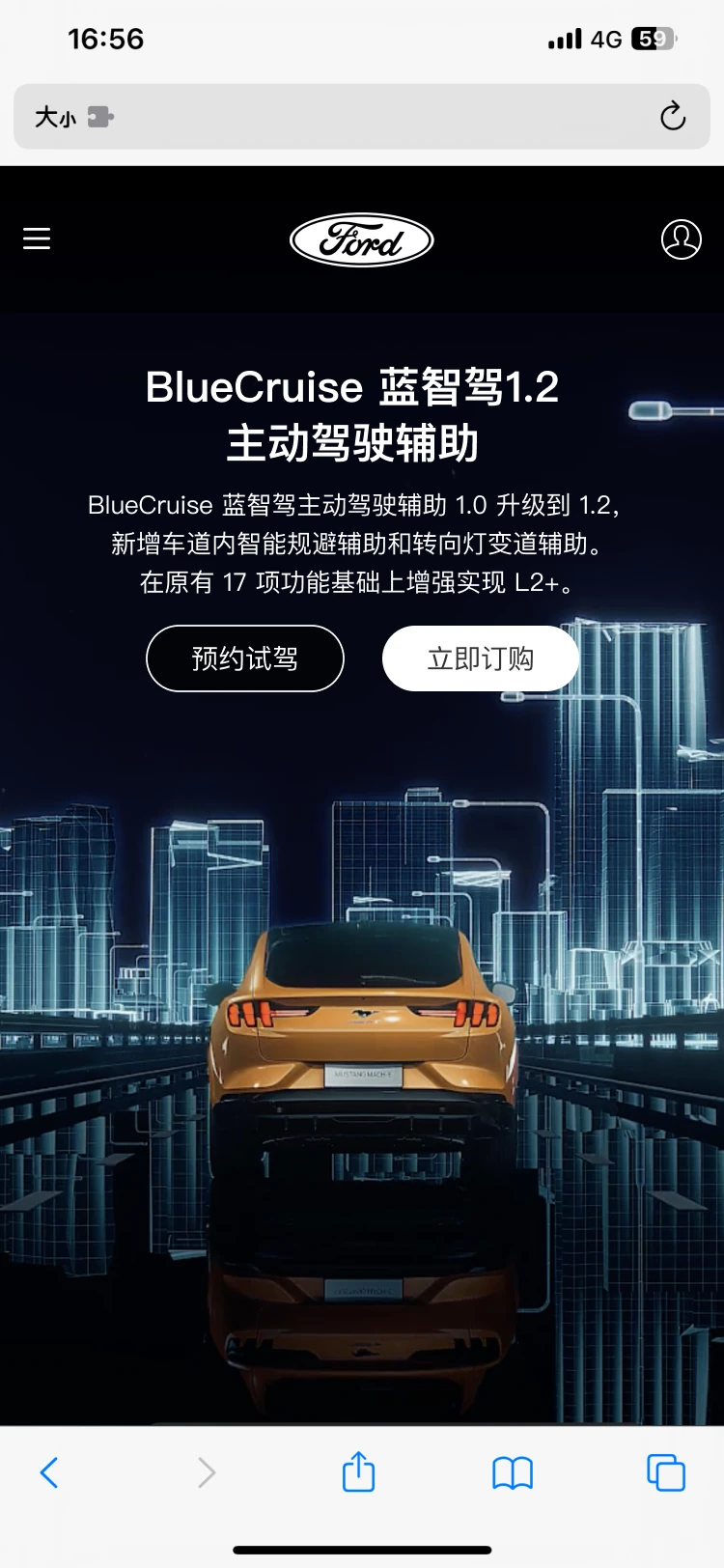
Web, mobile H5, app-embedded, and WeChat Mini Program versions share the same chapter logic and visual voice. Navigation, controls, content length, and interaction behavior adapt to each host environment.
Full-screen editorial chapters, persistent navigation, and direct test-drive and purchase actions.
Browser-aware controls, vertical storytelling, swipeable cards, and a compact reading rhythm.
Shell-specific navigation, platform chrome, and interaction behavior adapted to the host environment.
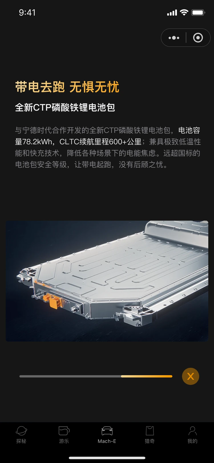
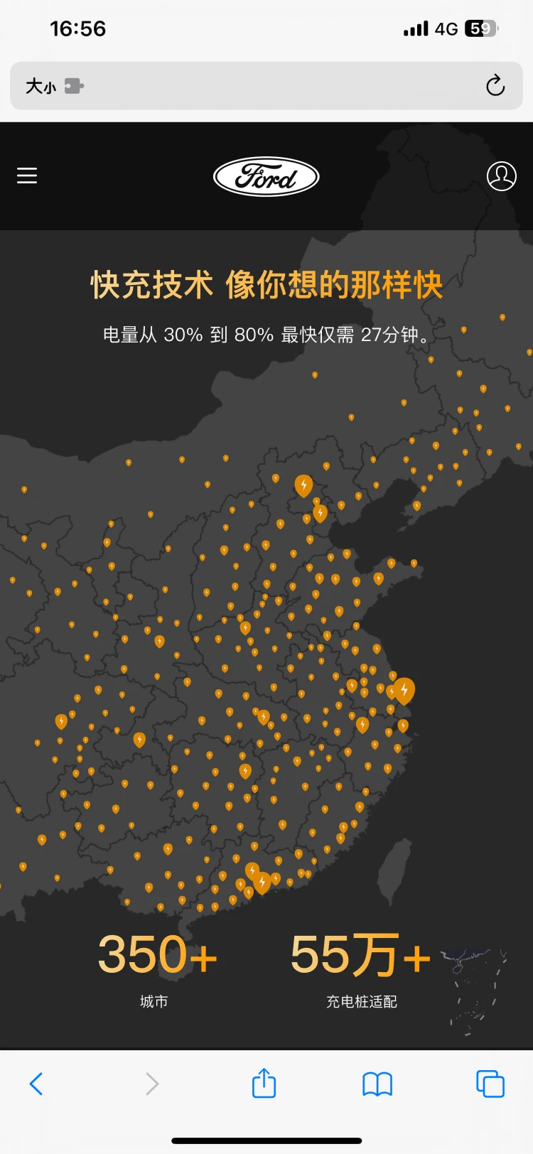
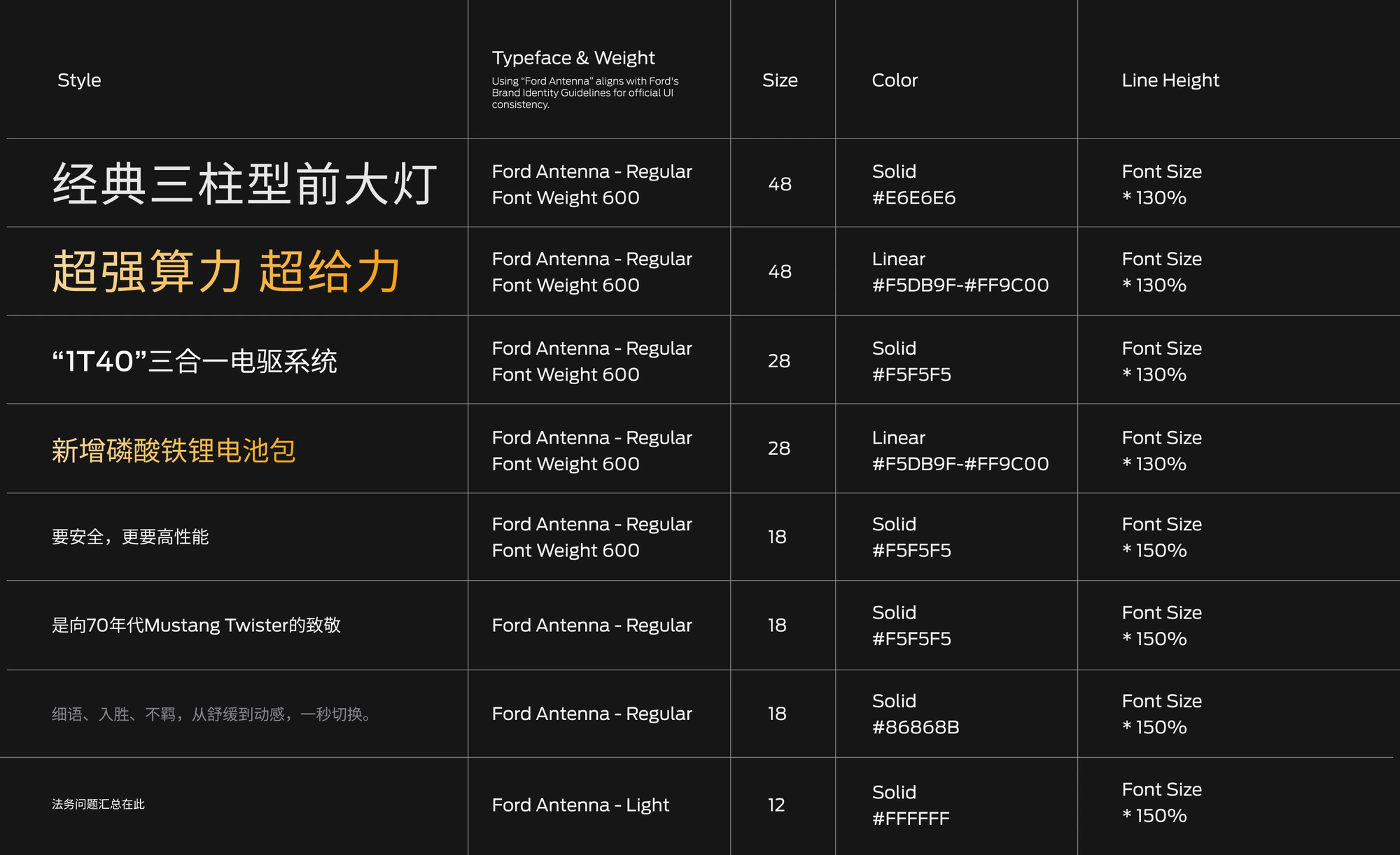
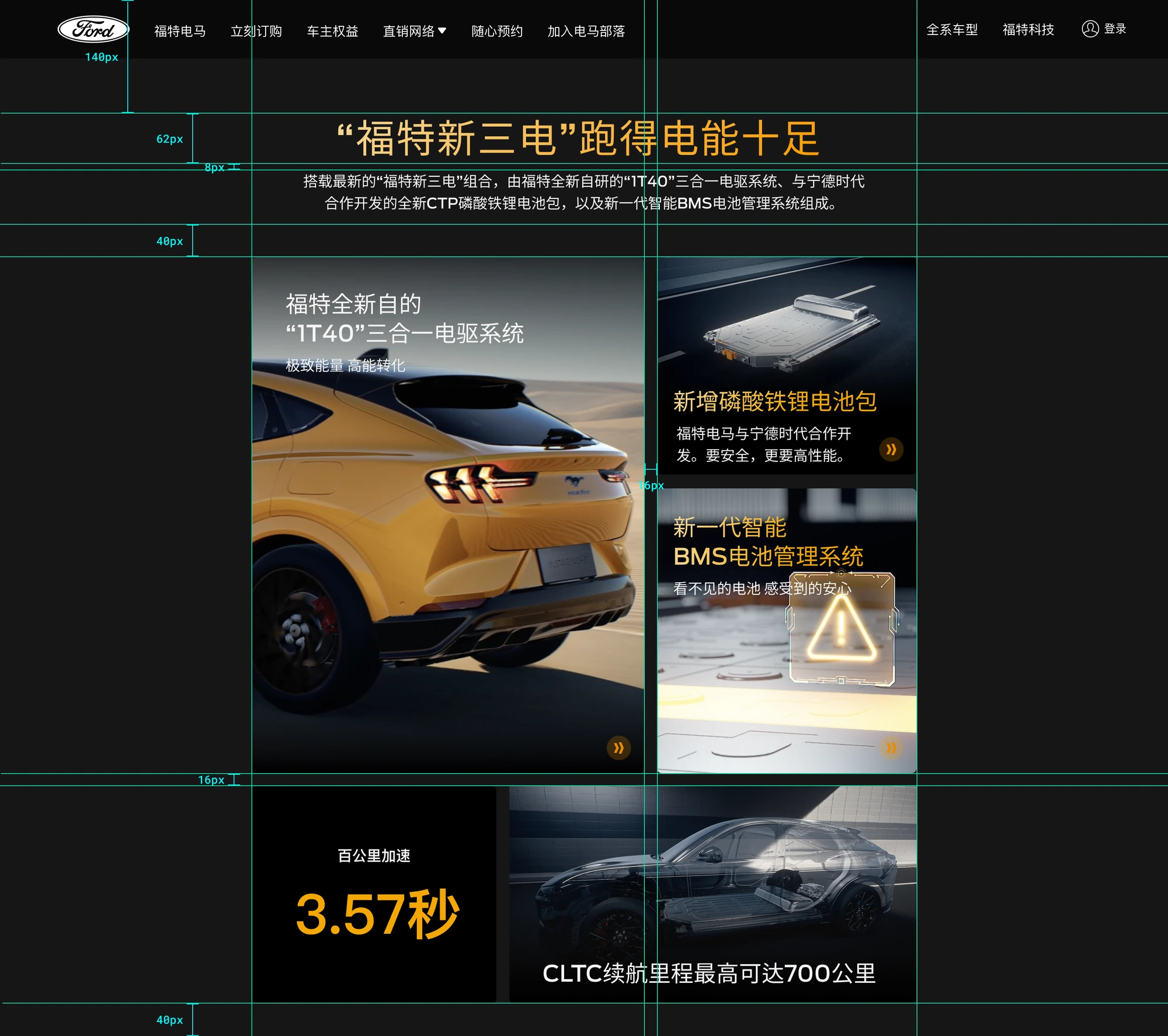
The delivery documented typography, page layout, spacing, background formats, motion timing and pacing, triggers, effects, and a directory for navigating the specifications.
The original project case-study materials report that test-drive reservation conversion increased after the new website launched.
Metric reproduced from the supplied project Figma. The source file does not include the measurement window or attribution methodology, so no additional causal claim is made here.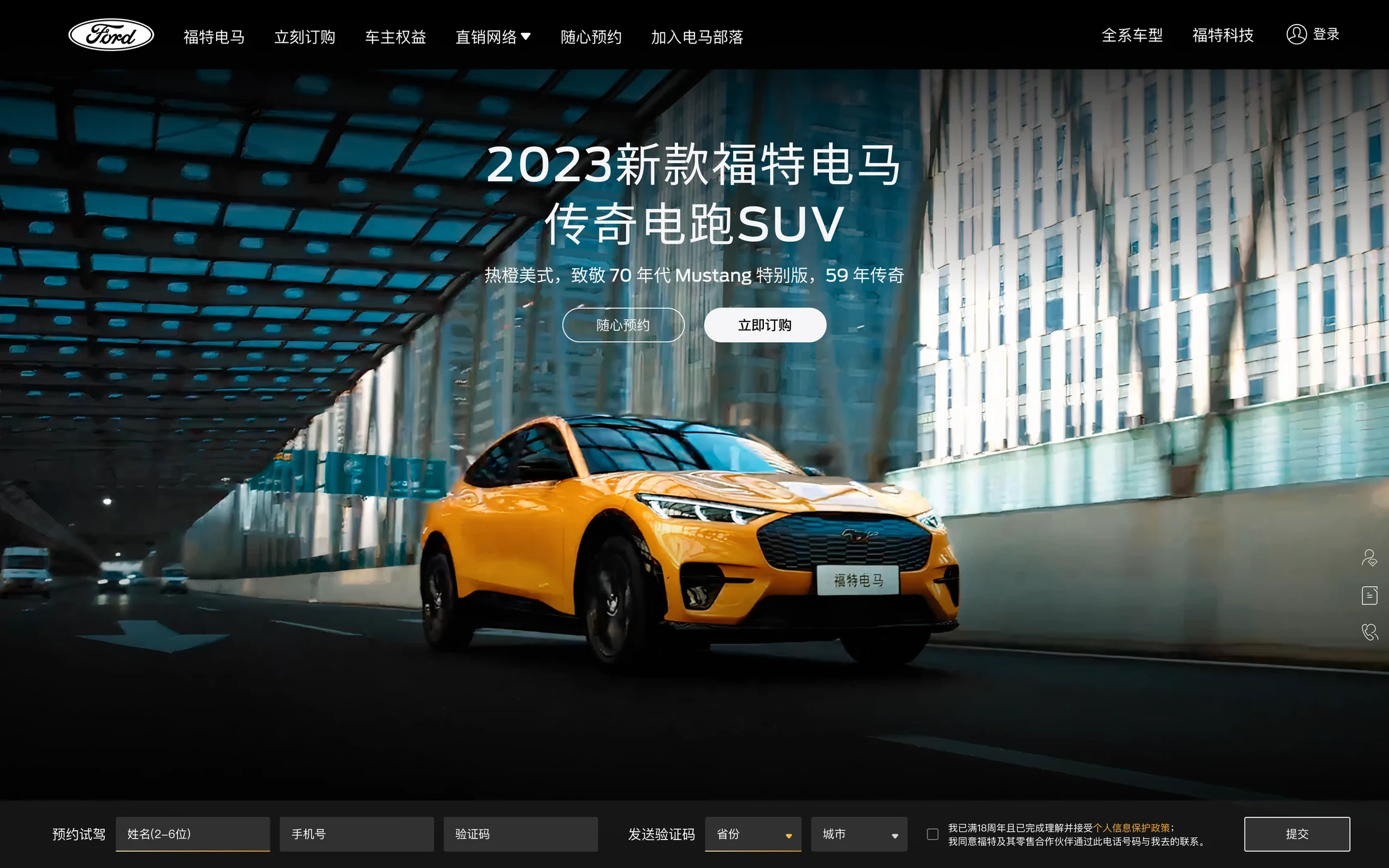
I can connect information architecture, visual storytelling, motion, multi-platform adaptation, and implementation guidance in one production-oriented system.
With more time, I would deepen usability validation and refine the narrative and animation of each chapter further.